Click Here to View This Page on Production Frontend
Click Here to Export Node Content
Click Here to View Printer-Friendly Version (Raw Backend)
Note: front-end display has links to styled print versions.
Content Node ID: 426630
Garmin has entered the terminal procedure charts market with the release of SmartCharts, which it explains as dynamic terminal procedures and airport diagrams that allow pilots to access information needed without the clutter and non-relevant information found on static charts.
SmartCharts are now available in the Garmin Pilot iOS app and cover the U.S. and the Bahamas. Garmin Pilot premium subscribers have access to SmartCharts at no additional charge, and anyone can try SmartCharts for 30 days during a free-trial period. For those who have previously used the free trial, Garmin has reset these to allow another trial so they can experience SmartCharts.
Under development during the past nine years, Garmin said SmartCharts adds several features to make pilots’ jobs easier. SmartCharts are dynamic and data-driven, not just raster-based replicas of static charts, and they smoothly “adjust and scale as the pilot zooms and pans within the chart,” according to Garmin. This also enabled Garmin designers to optimize the way information is displayed on the charts, allowing pilots to see the information they need when they need it and minimizing distracting, non-pertinent information.
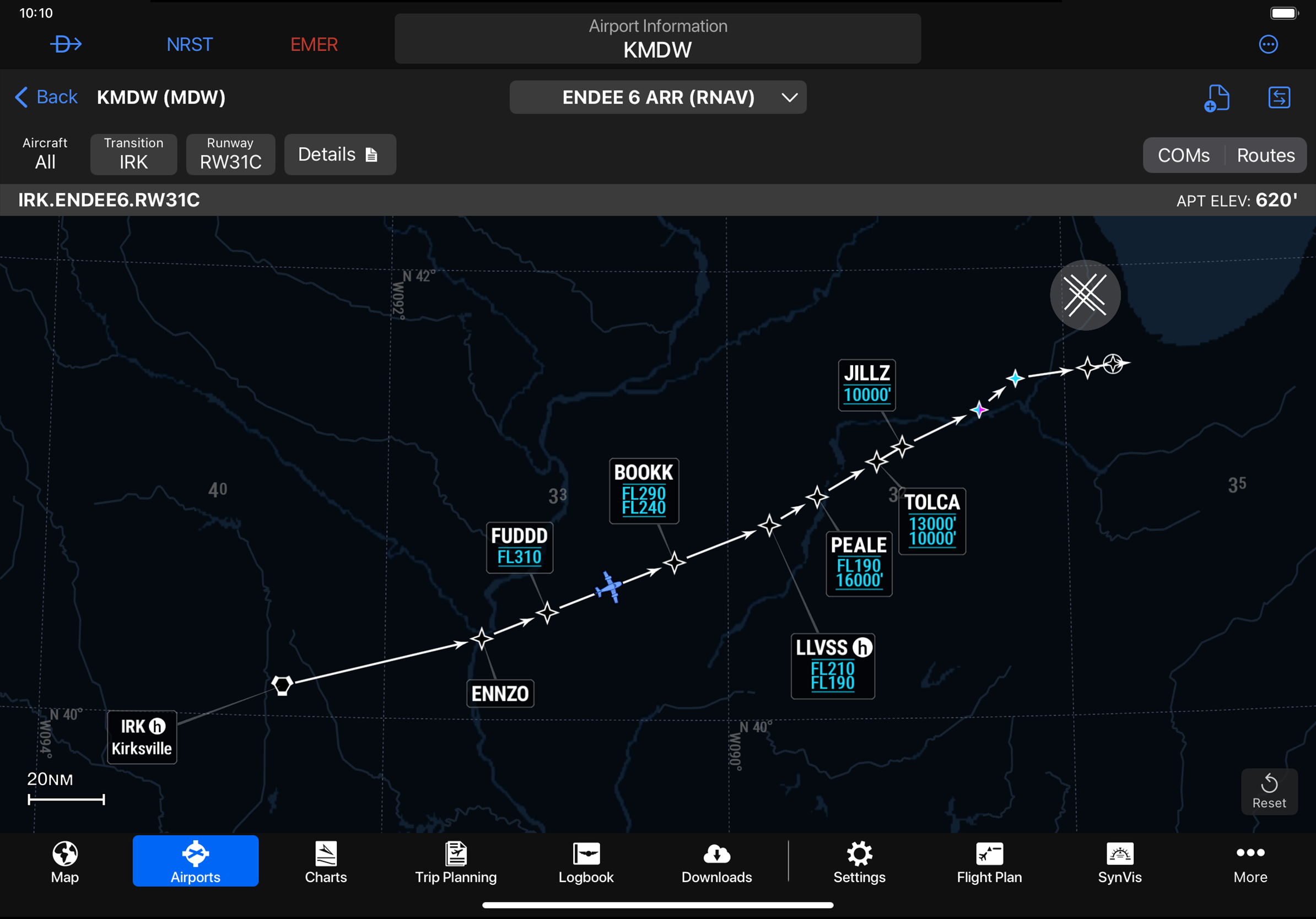
For example, when planning a flight with an arrival procedure, instead of looking at two pages of charts with multiple arrivals and notes for each path, the SmartCharts user can simply pull up the arrival procedure and select aircraft type, transition, and expected runway. The depicted chart will show only the flight path and restrictions for those criteria, which is much less cluttered than the typical STAR chart. Buttons above the chart allow the user to view more information, such as details for that arrival, applicable coms frequencies, and route information. The result is a clean-looking, uncluttered arrival that is much easier to interpret and is also georeferenced (shows the flying aircraft on the chart) to provide maximum situational awareness.
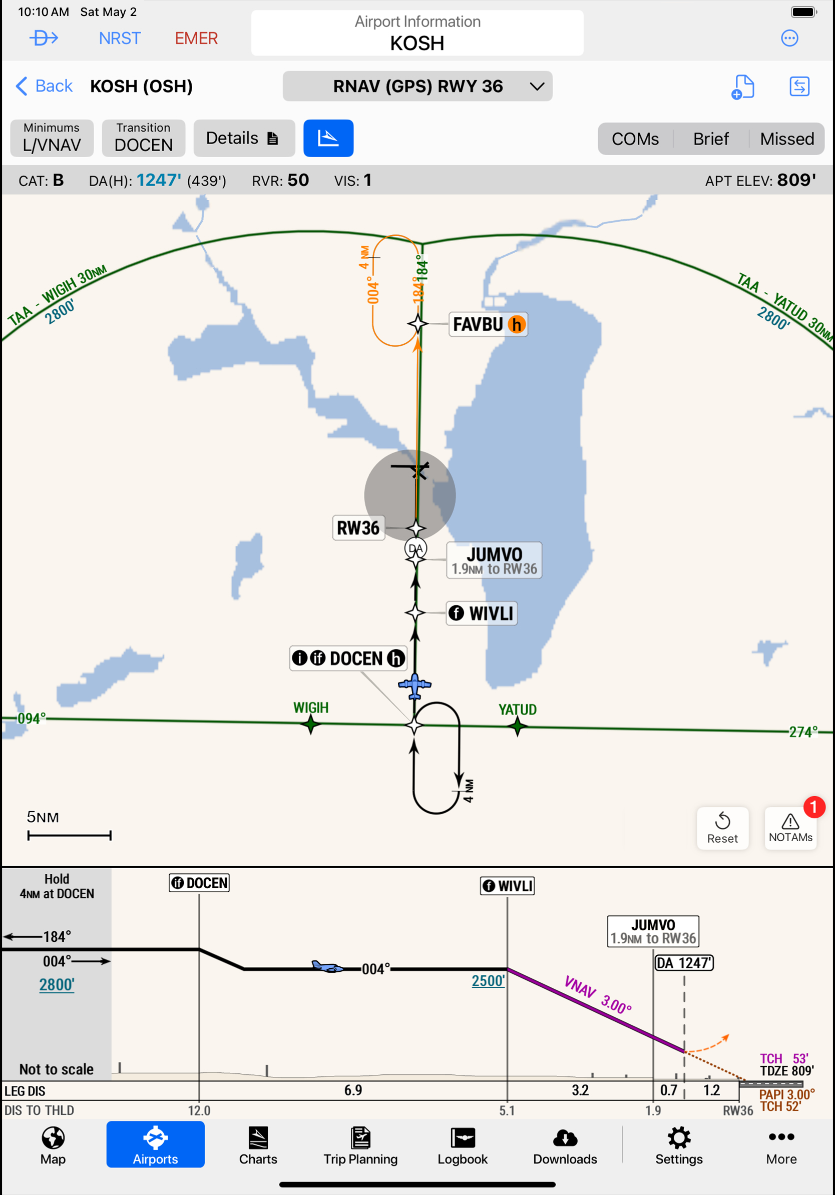
Similarly, approach charts can be adjusted to match the category of aircraft, and minima automatically change to reflect the category and inoperative equipment, such as approach lights that are unavailable. Detailed information is available at the touch of a button. In addition to a coms button for frequencies, approach charts also have a handy “brief” button that shows a briefing strip with important summary information and a “missed” button with a graphically depicted step-by-step procedure for the missed approach. A notams button is also available, with only notams applicable to that procedure displayed, although other notams for that airport are available.
A most welcome feature on the geo-referenced approach charts is a profile view that is also geo-referenced. For the first time in a charting app, pilots can see the map showing the aircraft’s position and the profile view also showing the aircraft as it descends along the glidepath with obstacles and terrain also depicted. Both the map view and the profile view can be zoomed independently. “This feature adds ultimate situational awareness of the aircraft’s position relative to the approach path, terrain, and obstacles,” according to Garmin.
During flight planning, pilots can sort approach procedures in the airport tab according to aircraft category and then view all of the available approaches’ minimums, visibility, and approach lighting systems using the “show with minima” button. When planning a flight, all of the procedures and airport diagrams are automatically stored in smart binders for the departure and destination airports.
Garmin designers greatly improved airport diagrams. Hot spots are colored to make them easier to see, approach light systems are drawn realistically, and even small details like windsocks with clever orange bands are clearly shown. Perhaps of most benefit to pilots are the yellow-and-black markings for hold-short lines and movement areas, accurately placed in their precise locations. Quick access buttons provide more details: runway, takeoff procedures, obstacles, takeoff minimums, and a climb gradient table; alternate minimums by aircraft category; and coms frequencies. The information is all easily accessible and eliminates the need to memorize arcane charting symbols. For those interested, a button is available to switch between the SmartChart and the original FAA chart.
“[This is] one area of aviation that hasn’t seen a lot of innovation,” said Kyle Ludwick, Garmin senior aviation marketing manager. Charting conventions haven’t changed much in the decades since Elrey Jeppesen first began publishing the charts derived from his drawings of airport features in 1934. “The iPad changed a few things from the charting perspective when it comes to terminal procedures,” Ludwick said, “but it didn’t do a whole lot. We digitized the charts so we didn’t carry that heavy case around.” The next important step was geo-referencing, and “that was super awesome,” he added, especially when coupled with the ability to overlay charts on the moving map along with weather, terrain, and traffic. Now with SmartCharts, “it’s very boiled down for what you’re doing,” he said. “There is no question that this is a better way to do it, situational awareness-wise.”